Film director · Portfolio
Toby Kearton
A focused place for the work.

The brief
The website shouldn’t compete with the films.
Toby Kearton is a film director and writer. His website needed to give his work a proper home online — somewhere considered and professional, but deliberately restrained enough to let the filmmaking remain the focus.
The aim wasn’t to create an online CV. It was to create a clear route into Toby’s work.
The approach
Let the work lead.
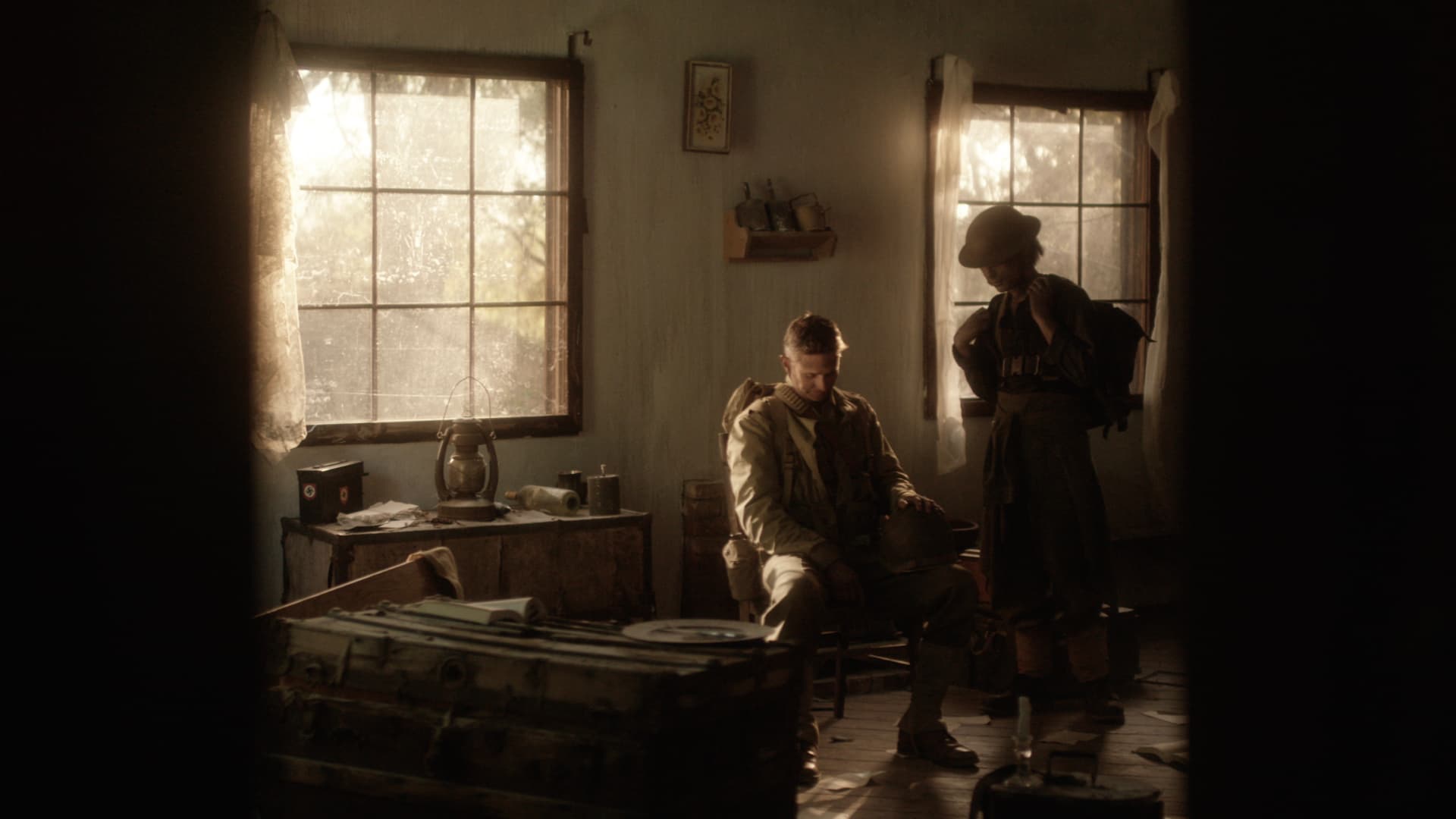
The site is built around the films themselves. Strong imagery, the showreel and individual projects do the storytelling, while the surrounding interface stays quiet.
Rather than forcing everything onto a single portfolio page, individual films are given their own space for imagery, context and credits.
Design principles
A quiet frame for the films.
- 01
Lead with the work
The films are the visual focus. The website provides the frame rather than competing for attention.
- 02
Give projects room
Individual work can be explored properly, with space for imagery, context and credits rather than reducing everything to thumbnails and titles.
- 03
Keep the interface quiet
Typography, navigation and interaction are deliberately restrained so they don’t compete with the filmmaking.
- 04
Make contact straightforward
Visitors can move naturally from discovering Toby’s work to getting in touch without unnecessary layers or distractions.

The finished website
A portfolio that feels like Toby’s work.
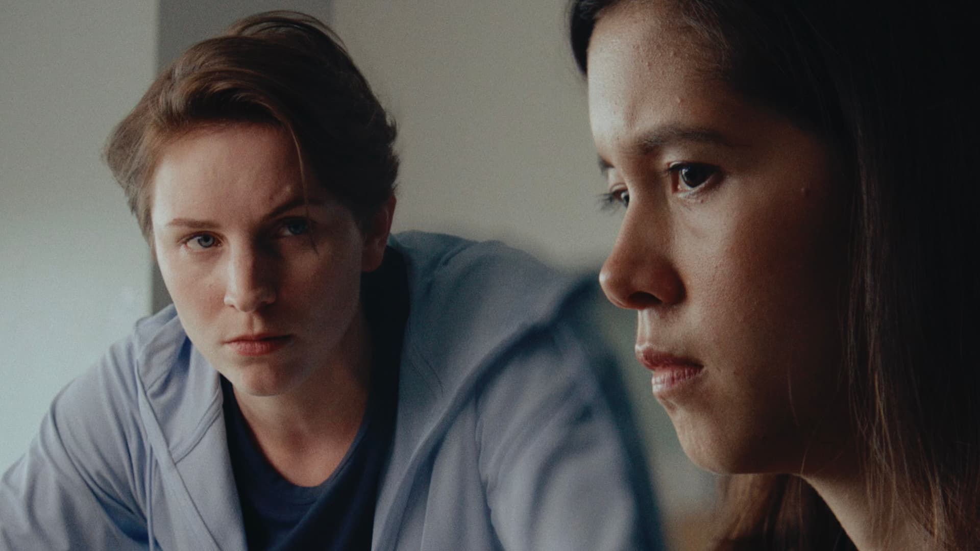
The finished website brings Toby’s showreel, films and project information together in one focused digital home.
The design stays deliberately in the background, giving the work room to make the impression.
Visit Toby Kearton ← Back to selected work